
10-year U.S. Treasury note yields have fallen by nearly 0.75% since late October. Fundamentally supporting the steep decline in yields is weaker than expected CPI and PCE inflation data. Further, the last BLS employment report shows a slowing of job growth. Additionally, and maybe most importantly, the Fed seems content that the recent tightening of financial conditions will do their job for them. On Friday, Powell further confirmed the Fed may be done hiking as he said the “risks are now balanced.” The market projects a Fed rate cut that could come early this spring. With that fundamental backdrop, let’s assess the technical situation. The following paragraph focuses on the recent yield increase and what that might portend. Further in this Commentary, we provide more technical and fundamental information to better gauge where 10-year yields may go.
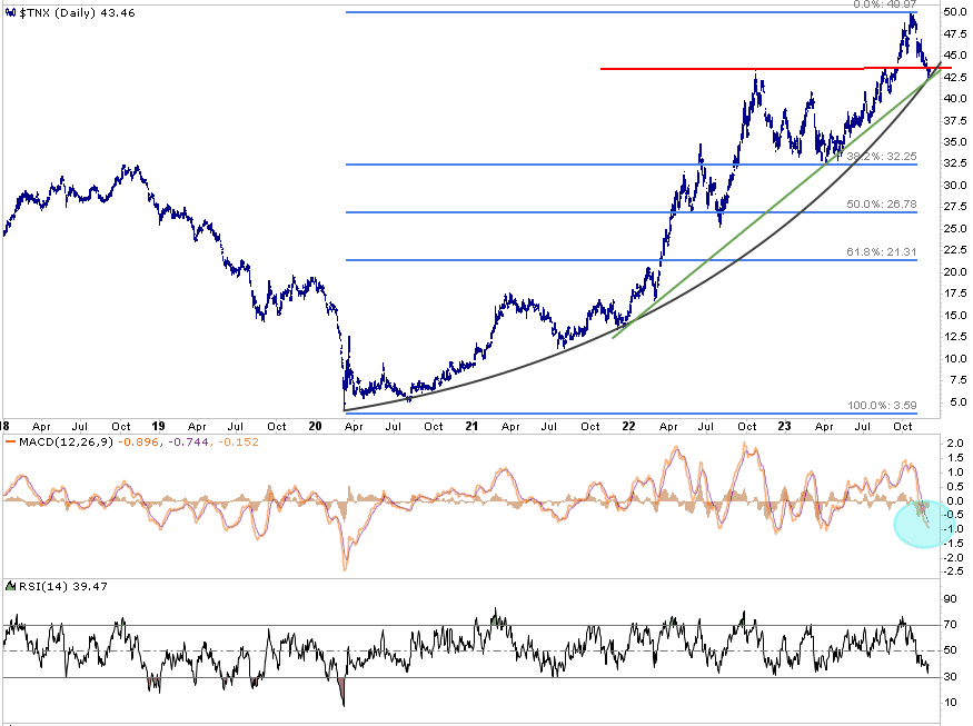
The graph below shows 10-year yields troughed below 0.50% and have since risen to 5.00%. The pattern of higher yields provides critical technical levels if yields are now headed lower. The most critical line is the red resistance line, which may become support for yields. The green linear trend line and black parabolic curve are very close to the red line. Both have supported yields in the past. If the three support lines are broken, odds favor a decent yield decline. If so, the blue Fibonacci retracement lines may be the next target. Assuming 5% was the peak, the first Fibonacci retracement is 3.22%. In the short term, bond prices are overbought. Technical indicators like the MACD and RSI, coupled with the support lines, argue yields may rise in the coming weeks, but the longer run looks promising for bondholders.
What To Watch Today
Economy
- No notable economic releases today
Earnings
Market Trading Update
The rally continued this past week, and we are approaching the 100% retracement of the July highs. Such changes the dynamics of a pullback to the previous resistance levels of 78.6%, 61.8%, and 50% retracements. With the 50-DMA coinciding with the last 50% retracement level, we expect the maximum drawdown of any correction to hold that level going into year-end.
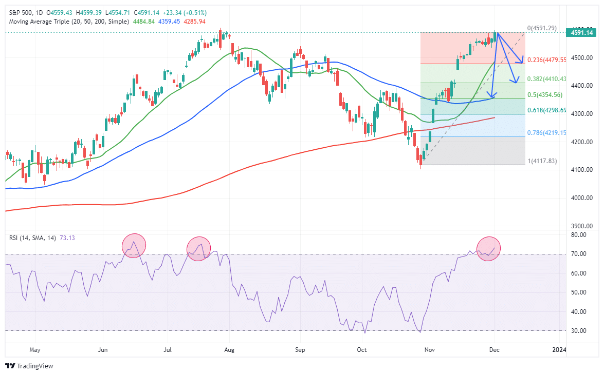
While it seems as if “nothing will stop the market,” such was the same sentiment we discussed in July in “Trading An Unstoppable Bull Market.” To wit:
“We must remember that market advances can only go so far before an eventual correction occurs. My best guess is that if the markets are to reach all-time highs this year, we will likely have a correction to reset some of the more extreme overbought conditions.”
Of course, that correction came the next month.
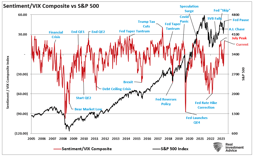
Notably, we noted in July that our gauge of individual and professional investors’ “positioning” is getting overly bullish, which also corresponds to the collapse in the volatility index. From a contrarian position, the higher the allocation to equities, the more likely the market is closer to a correction.
As shown, we are once again at similar levels.
Despite this bull market run once again seems to be “unstoppable,” it won’t be. We still expect a short-term correction or consolidation to provide a better entry point to increase equity positioning. Trade accordingly.
The Week Ahead
The Fed will be on media blackout with respect to the coming meeting on December 13th. As such, employment data will take the stage this week. JOLTs on Tuesday, ADP and jobless claims on Thursday, and the BLS report on Friday will further inform us of the state of employment. Following last week’s lower-than-expected 150k increase in jobs, the market expects the economy added 160k jobs. Data for November can be tricky due to seasonal adjustments related to Thanksgiving and the beginning of the holiday sales season. Often, jobs data for November and December are well above or below expectations but revised in the future to levels closer to what was expected at the time.
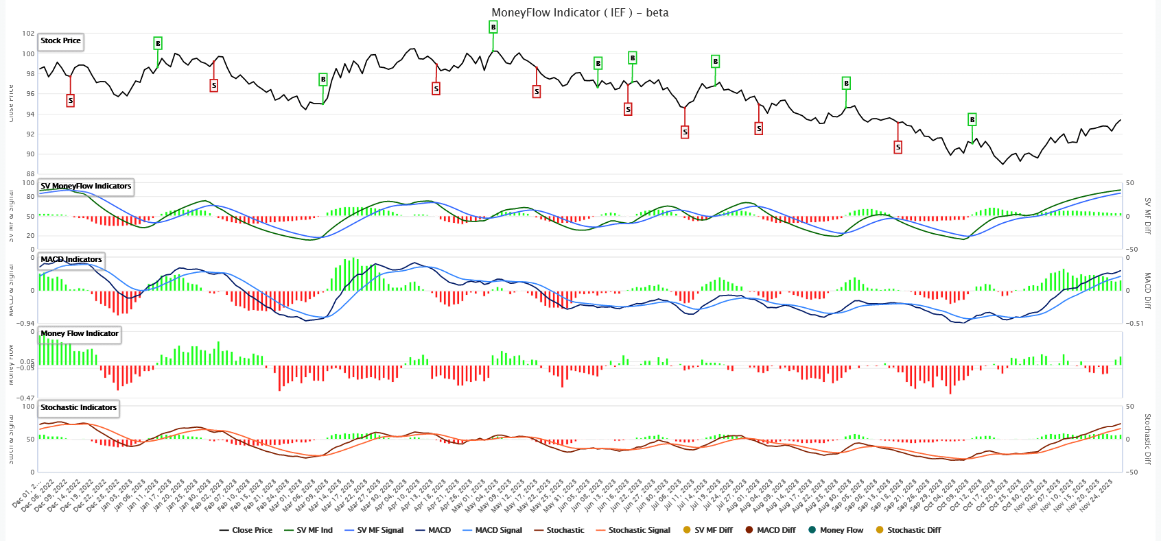
More Technicals On 10 Year Yields
As we note in the opening, the MACD and RSI warn of oversold yields. The graph in the opening is of yields, so oversold relates to declining yields. The first graph below, courtesy of SimpleVisor, is the price of the ETF IEF, which holds 7 to 10 year UST notes. The line below the price graph is the SV Moneyflow Indicator. This is our proprietary stochastic model. The indicator is at high levels and getting ready to cross. Such is confirmed in the MACD and Stochastic graphs below our indicator. Given the sharp decline in yields and the corresponding increase in bond prices, a decline in prices or a period of consolidation to work off overbought signals would be healthy. However, the risk for bears is that the next round of employment and inflation data will underwhelm expectations and push yields below the key support we note in the opening.
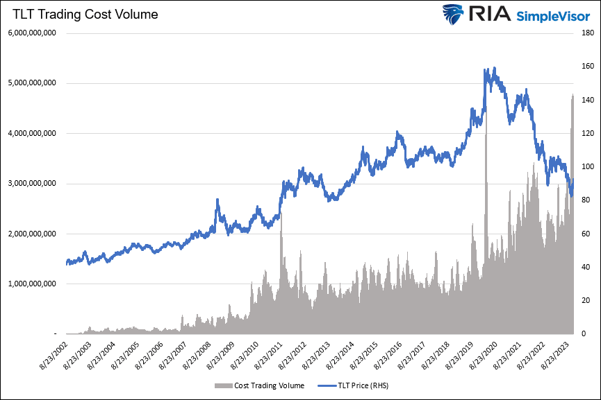
The second graph helps ascertain if the 5% 10 year yield was the peak yield for this cycle. Often, investors capitulate at market peaks and troughs, and such events occur with significant volume. The graph charts TLT along with its trading cost volume. Instead of using the number of shares, which is common, our volume indicator multiplies the number of shares traded and the price. This produces a dollar volume, making volume comparable across all price ranges. It shows that the dollar volume occurring at 5% yields was the largest in 20 years. The last time TLT saw anything close to the same volume was the capitulation event, which happened when yields troughed and TLT peaked.
Fundamental Outlook For Bonds
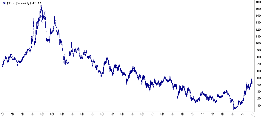
Lastly, we take a look at the big picture. The graph below shows a clear downward yield trend since the early 80s. Even without drawing lines, we can see that the trend has broken. From a technical perspective, that is concerning. However, even if the long-term trend has broken, which we doubt, it’s entirely possible a retracement of rates much lower to form a double bottom or a higher low is likely.
The reason we doubt the trend ended is fundamentals. The growth of government debt weighs negatively on future economic growth. The massive stimulus worked. It lit a fire under the economy, and prices shot higher. Broken supply lines also fueled inflation. However, the enormous amount of government borrowing used to pay for the stimulus will detract from growth and be disinflationary or deflationary in the future.
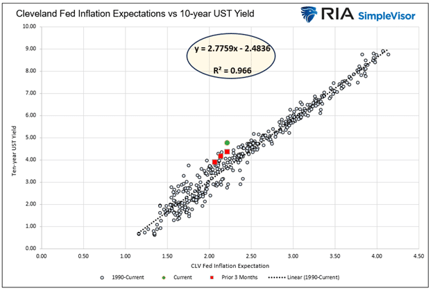
Bonds tend to track inflation and inflation expectations closely. The second graph shows the strong correlation between the two. As such, inflation holds the key to where long-term bond yields are going. But in the short run, technicals and market narratives can cause brief divergences between the two.
As we have said before, unless this time is different, expect the thirty-year trend of lower yields to continue.
Tweet of the Day
Related: Recessionary Indicators Update. Soft Landing or Worse?